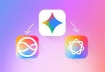
Google updates its ‘G’ logo icon with new gradient design. This is the first big visual change in 10 years. The updated icon shows Google’s move towards modern design.
It also highlights the company’s focus on AI-based tools. This small but fresh change has caught user attention globally.
also read:Â Meta Introduces Its Dedicated AI App: Everything You Need to Know!
Google’s New ‘G’ Icon Now Has Gradient Colors
Google recently changed its famous ‘G’ logo icon silently. The new design replaces the old solid color sections. Now, the red blends into yellow, yellow into green, and green into blue. These four main colors now flow smoothly together. This creates a nice gradient effect in the logo.
The updated icon still keeps the same four colors. These colors – red, yellow, green, and blue – are part of Google’s identity. But the new style makes them look modern and fresh.
The hard edges between colors are now gone. It feels more soft and fluid to the eyes.The updated logo was first noticed by 9to5Google. It appeared first in the Google Search app on iOS. Later, the new icon also started showing on Pixel devices.
Android users using beta version 16.18 also noticed the new design. But the old icon is still seen in the Play Store.
Why Google Made This Logo Change After 10 Years
Google last changed its logo in September 2015. That time, it introduced a new typeface called Product Sans. The ‘G’ icon also changed from a lowercase blue ‘g’ to a modern uppercase ‘G’. Since then, this is the first major update to the icon.
The new gradient design connects with Google’s AI-focused future. Google’s Gemini AI logo also uses a color gradient.
That logo blends blue, pink, and purple beautifully. Even the AI mode in Google Search has gradient colors. The updated ‘G’ icon now matches this modern style.
Google is slowly moving its design language toward gradients. This design style looks dynamic, smooth, and tech-friendly.
It gives a hint that more Google products may get this update. Though there is no official word yet, changes may come to Chrome or Maps too.
Importantly, the six-letter Google wordmark remains unchanged. It still shows the same four solid colors. Each letter continues to use one bold color from the palette. So, the changes are only made to the ‘G’ icon for now.
What This Design Update Means for Users
This logo change may seem small but it matters. It shows Google is refreshing its visual identity. The company is building a new look that matches its AI goals. The gradient gives a premium and polished feel to the icon.
For iPhone and iPad users, the new icon is already live. Android users using the beta version can also see it now. But the update will reach all devices slowly. Google is likely to roll it out fully in coming weeks.
This change is more than just about looks. It shows how Google is evolving with time. The company wants its icons to feel current and smart.
The new design is simple, soft, and full of meaning. It reflects the AI shift happening inside Google’s apps and tools.
Google updates its ‘G’ logo icon with new gradient design. This small change marks a big step after 10 years.
The smooth color blending makes the icon feel modern. It also connects well with Google’s AI-based services. As the design rolls out, users can expect a fresh look.


